Designing for the road. How to design for moving people and things
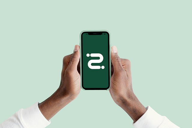
Boda Guy is a delivery as a service app that I have been working on for the past 8 months. Download for Android; Boda Guy — Apps on Google Play
Unlike most startups that start off with an idea plus engineering, Boda Guy started off with an idea plus design. Whereas this is often not ideal in the short run it makes sense in the long run as you don't build a product first and design later. You design and engineer side by side
When I joined the company, the first thing I did was set up a design system. This was during their peak when every single company was pushing for design systems straight from Figma to Airbnb. Before the fame of design systems, there were style guides which were inefficient and not updated in real time to match the business and company goals as well as changes to user perspectives.
The design system I created is named GEAR which is a reference to gears that run machines as the concept was a design system that could run a huge chunk of apps at once.
Initially, the engineering team was not so up to the idea, it was new to both my engineers but both were also web developers so are familiar with component libraries which made translating the idea a bit easier.
Building Gear
The design system is the first piece of the puzzle, not the last, and should help design faster while maintaining high standards and consistency.
If you are familiar with startups, you might be familiar with the concept of them not having enough time to think so many ideas through. This also means there is not enough time for both design polishing and engineering, at least that was for us. So, we could not take 3 months (which was my projection) to build a design system. So, I decided to build our design system off Fluent design 1 (Microsoft Design)
I had three goals in mind;
- Building a design system that is cross platform so we only maintain it but not redo it
- Building mobile first
- Have consistency through it all
This made me study all design systems I could get my hands on starting from Material design by Google, Human Interface guidelines by Apple and my favorite the Huawei UX standard. This helped me shape a design narrative.
I however decided to stick to the Fluent line because just like startups, Microsoft has seen it all and has built a design for almost every single machine on earth so they do know something about responsive and scalable design. And i myself have a love for designing operating systems so we were a match.
The following sections cover the different parts of the design system.
Color
If you are familiar with designs you might be familiar with how insanely hard colors are. Alot of designers (including me) think color is just about the color picker. Color can decide if something looks good on its own or needs support to look good for instance try designing with this color palate;
@theme { --color-yellow for me and you-50: #FFFFF7; --color-yellow for me and you-100: #FFFFED; --color-yellow for me and you-200: #FFFED4; --color-yellow for me and you-300: #FFFEB8; --color-yellow for me and you-400: #FFFB82; --color-yellow for me and you-500: #fff94d; --color-yellow for me and you-600: #E6D83E; --color-yellow for me and you-700: #BFA92A; --color-yellow for me and you-800: #997C1C; --color-yellow for me and you-900: #73550F; --color-yellow for me and you-950: #4A3007;}
You will sooner or later realize how complex color gets as it goes up going from one shade to more shades and to more places)
Because of the reasons above, I set up colors first using color tokens.
If you have worked with design systems before (both code and design) you might be familiar with color variables in CSS but as colors get complex so do their names. Color tokens were introduced to the world by the team at Atlassian and since then different teams use/name them different things.
For us consistent color usage creates visual continuity throughout experiences and even across products. The easiest way to guarantee uniform color usage is to use Gear’s design token system. Each value in the Gear palettes is stored as a context-agnostic global token. Alias tokens then provide the context that makes it easy to choose the right color without having to hunt down hex codes.
Our color library is so huge and covers alot of edge/use cases that pasting the tokens here breaks Medium but it look something like this
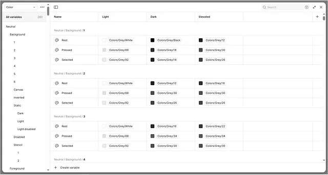
The color system covers modes from Light mode to dark mode and elevated mode (Elevation — Material Design 3).
Elevation mode is what is famously known as hover, but we don't hover on mobile but rather a UI element gains height on touch to mainly show feedback to the user like the pressed state.
The design system also has tokens for other things like.
- Typography
- Shadows
- Stroke width
- Size (screen size)
- Motion (Beizer curves)
- Corner radius
Empowering Iteration Through Data-Driven Tooling
After gaining deep insights from our on-the-ground driving experiences, we transitioned into hands-on design work — sketching, debating, and refining concepts rooted in our core principles of efficiency and safety. Unlike previous design cycles, this phase demanded a more dynamic and responsive approach.
To meet that challenge, we introduced specialized tooling into our workflow that proved essential to the product’s evolution. By developing custom web-based tools, we were able to seamlessly integrate live data into our design mocks, enabling rapid iteration and more informed decision-making throughout the process.
I built a few tools (design and code) during this stage to iterate ideas before we built them out into production ready code.
Try some here;
- Incoming order screen for drivers to test the concept of draggable buttons and sound design (I made the sound)
Try here👉🏾 DRAGGABLE BUTTONS
- End to end chat between driver and client/rider (switch between rider and driver from the top). You might have to wait a few minutes for the server to hit up.
Try here 👉🏾Real Time Chat
Designing for the physical world
Creating a delivery app begins with understanding the dynamic interplay between digital interfaces and the physical world — and how these interactions shape user behavior and influence society at large.
A well-defined design system, equipped with the right tools, not only streamlines collaboration between designers and engineers by reducing time spent on surface-level tweaks, but also empowers them to uncover meaningful patterns and craft solutions that drive real-world impact.
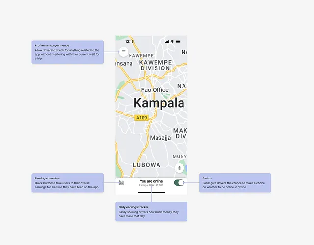
Designing for drivers
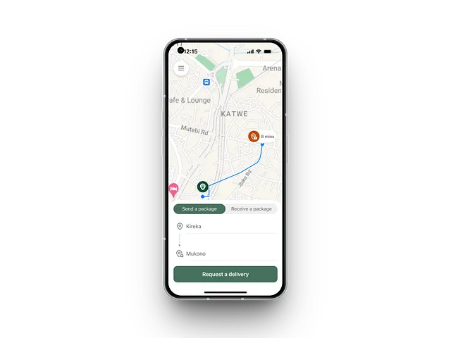
One of the core design principles behind the driver app was to ease the burden on drivers — allowing them to concentrate on delivering smooth, stress-free rides for everyone. My goal was to ensure that essential features were built right into the app, with navigation being a top priority. So we began with a fundamental question: What does effective navigation look like for a Boda Guy driver?
Delivering with Boda Guy is all about that magic moment when a driver meets the client. From there, it’s a ride to the drop-off point, a handoff to the recipient, and then straight on to the next pickup. But not every delivery is straightforward — sometimes the driver has to park and walk inside to collect a package, and that’s where navigation can become unexpectedly complex.
Mapping
Nailing navigation across all touchpoints is no easy feat. At Boda Guy, we rely on both Google Maps and Mapbox as our primary mapping platforms, layered with additional supporting technologies. Mapping itself is inherently complex — so the real challenge lies in designing systems that stay intuitive and usable despite that complexity.
The biggest question that mapping systems answer on the UI is “What's next?” Once a delivery has been successfully completed, it’s important that navigation is ready with the best route for the next trip or letting the driver know what exactly to do after that trip.
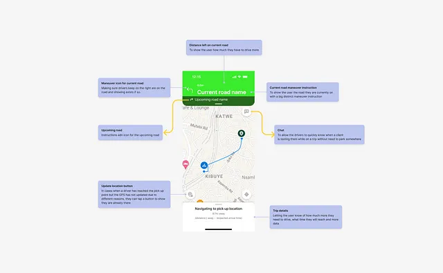
To distinguish between different location types and driver activities, we crafted tailored visual cues for each stage of the journey. From custom cartography and maneuver icons to dynamic pins, side-of-street indicators, route previews, and camera animations — every element plays a role in clearly communicating the driver’s path.
At the very core we built a heavy part of navigation following Navigation | API Docs | Mapbox
Boda Guy Navigation is purpose-built for drivers — and we’re just getting started. We’re actively gathering insightful feedback from the field and making it a top priority in future updates. With our core features now live, we’re energized by the design possibilities ahead.
Designing for users
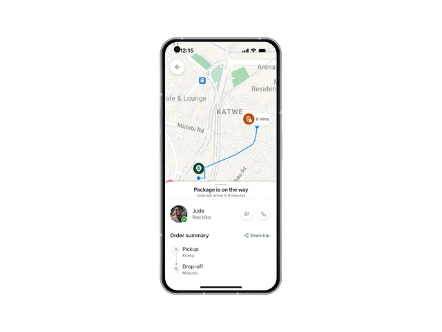
On the user’s side this means designing for status update. The delivery system and technology are too clunky and so many things happen at the same time but a user needs to know what is happening, where my driver is and so much more all into the interface.
Sign up/log in
Unlike most similar apps, this app has no log in/sign up. Users can send things without necessarily creating an account. This in return reduces set up friction and eases testing for users that just want to have a look.
So how do we track users? We have other ways we do this but our primary is that the order gets delivered. If we can do that well then, we are doing great.
Two-way communication
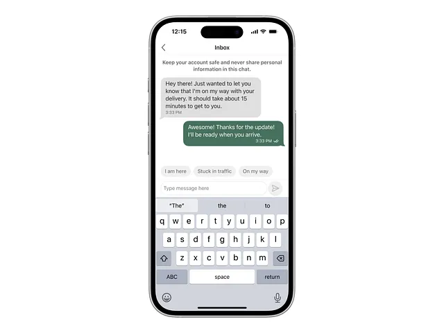
Relying on GPS is not enough especially for deliveries in countries that are not well marked/updated GPS-wise; to go around this we built in chat. A feature that allows users to text drivers during the duration of a trip.
Looking at other competitors in the same space this is a secondary feature on our end, it's a primary feature. This allows users to add more detail to deliveries and make trips easier.
We also have quick replies/ice-breakers built in to make communication more seamless.
Through this project, we tackled the complexities of digital map design by leveraging data-driven insights and rapid prototyping, ultimately delivering a refreshed and high-quality product experience.
Design is never finished
Even with the public launch behind us, we know great design is never truly done. Boda Guy will keep evolving — driven by our ambition to redefine how maps can power the most efficient experiences possible.
Thank you to the team involved 👉🏾 Boda Guy