UI/UX design is a very broad field that seems to have no end just like the galaxy but there are things that have been there to guide design. Junior designers barely get to know most of thus stuff despite the availability of resources.
Growing as a designer you learn lots of stuff courses never tell you about things like bottom sheets, modals and stuff like that (which is why we are here actually) so I will go through one by one and how they are used (for both Android and iOS.
I will be using Google’s Material design which a design system that was developed by Google in 2014. It is based on the principles of physical paper and ink, but applied to digital interfaces. It uses more grid-based layouts, responsive animations and transitions, padding, and depth effects such as lighting and shadows.
In the case of Apple I will be using Apple’s Human Interface Guidelines (HIG) are a set of recommendations for designing and developing apps for Apple platforms. They cover essential information about platforms, foundations, patterns, components, inputs, and technologies.
Badges
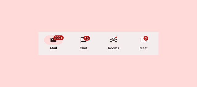
A badge is a small, filled oval containing a number that can appear on an app icon to indicate the number of unread notifications that are available. After people address unread notifications, the badge disappears from the app icon, reappearing when new notifications arrive. People can choose whether to allow an app to display badges in their notification settings.
Badges show notifications, counts, or status information on navigation items and icons (According to Google’s material design guidelines).
They are the red dots, usually with a number inside, that appear on the app icons of your home screen, in the App Library, or on both or neither. Notification badges indicate that you have unread notifications from that app.
In the case of Apple, a notification can present a customizable detail view that contains up to four buttons people use to perform actions without opening your app. For example, a Calendar event notification provides a Snooze button that postpones the event’s alarm for a few minutes.
This UI pattern is present in both Android devices and iOS devices but on the iOS side, they are called notification badges.
For best practices;
Checkbox
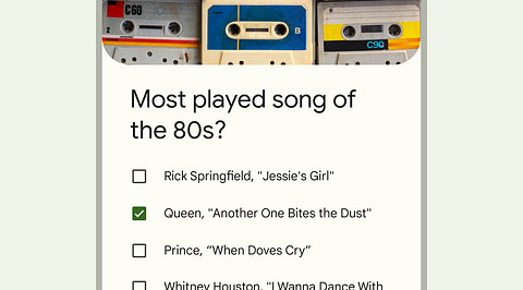
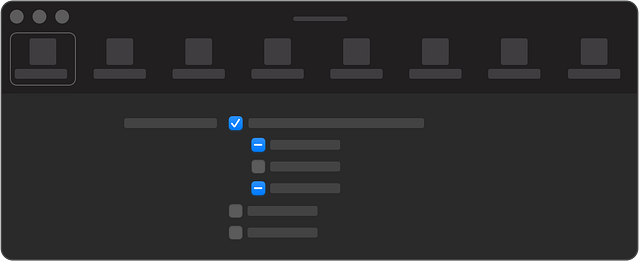
Checkboxes let users select one or more items from a list, or turn an item on or off. These are commonly used with surveys and stuff like that. Basically things that need one or more options
Google’s material design system advises that Checkboxes should be used instead of switches if multiple options can be selected from a list
In the case of Android, Radio buttons or Switches can be used alternatively for selection controls.
Apple defines a checkbox as a small square button that’s empty when the button is off, contains a checkmark when the button is on, and can contain a dash when the button’s state is mixed. Unless a checkbox appears in a checklist, a descriptive label follows the button.
Radio buttons
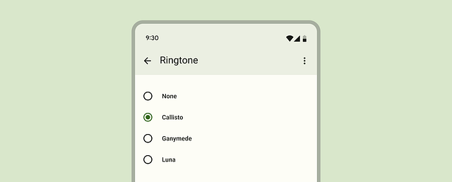
A radio button is a small, circular button followed by a label. Typically displayed in groups of two to five, radio buttons present a set of mutually exclusive choices.
Radio buttons are the recommended way to allow users to make a single selection from a list of options.
Only one radio button can be selected at a time.
Radio buttons are not common with Apple design as they seem to make content look clustered and in most cases toggles are used. They are however very common with Androids especially in the settings.
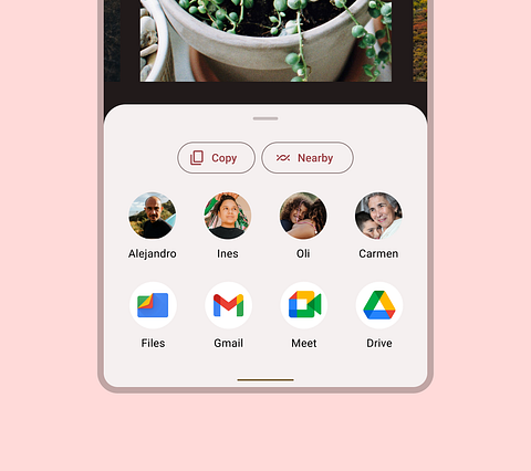
Sheets
These are used by both companies and there are two types of sheets on both sides.
Starting with Google, it has bottom sheets and side sheets.
Bottom sheets show secondary content anchored to the bottom of the screen.
Bottom sheets display supplementary content and actions on a mobile screen. They are a very versatile concept that can be used in different modes and with different heights.
They can have a drag handle or not have one depending on the way you want it to operate basing on the content it holds as well.
Anatomy
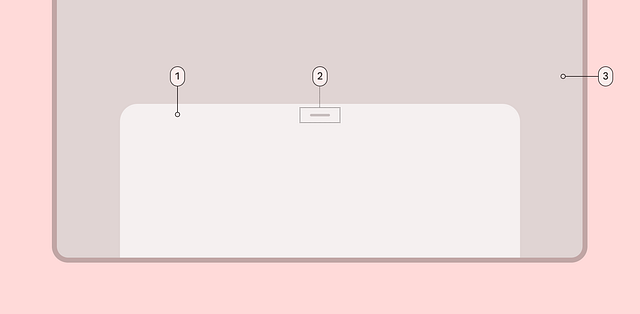
- Container
- Drag handle (optional)
- Scrim (modal only)
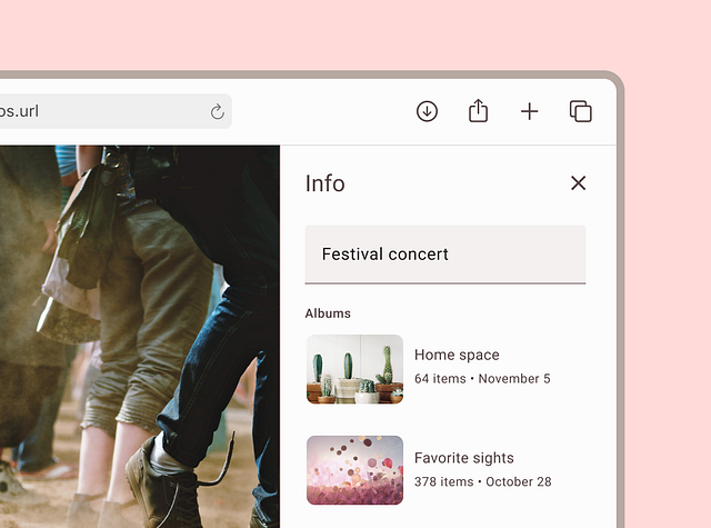
The other type of sheets is called the side sheets which are mostly used with larger screens.
Side sheets show secondary content anchored to the side of the screen.
There is two types of side sheets; standard side sheet and the modal side sheet
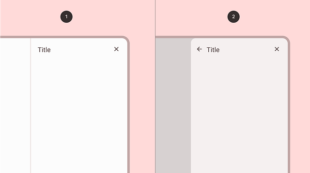
- Standard side sheet
- Modal side sheet
Usage
Standard side sheets display content that complements the screen’s primary content. They remain visible while users interact with primary content.
Modal side sheets are preferred in compact window sizes, like mobile, due to limited screen size. They can display the same types of content as standard side sheets, but must be dismissed in order to interact with the underlying content.
Apple has two types of sheets thats the Sheets and the Action sheets
Sheets help people perform a scoped task that’s closely related to their current context. By default, a sheet is modal, presenting a focused experience that prevents people from interacting with the parent view until they dismiss the sheet.
Sheets can carry different tasks from setting an alarm to even the settings or copying and pasting some content. Sheets provide a great user experience as the keep the user engaged in almost two actions at once but perfectly.
Sheets vary in sizes (there is two recommended sizes). Some are low and while others cover up a large part of the screen.
A resizable sheet expands when people scroll its contents or drag the grabber, which is a small horizontal indicator that can appear at the top edge of a sheet. Sheets resize according to their detents, which are particular heights at which a sheet naturally rests. Designed for iPhone, detents specify particular heights at which a sheet naturally rests. The system defines two detents: large is the height of a fully expanded sheet and medium is about half of the fully expanded height.
Action sheets
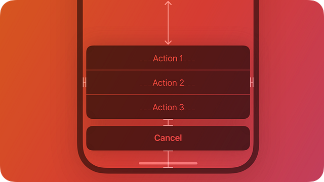
Action sheets are a type of sheet that present choices related to an action people initiate. They are modal views that slide up from the bottom of the screen and require people to tap an option or cancel the action1. Action sheets are useful for providing quick access to alternative ways of completing a task or providing additional functionality.
For example, when people cancel the Mail message they’re editing, an action sheet provides three choices: delete the edits (or the entire draft), save the draft, or return to editing.
Action sheets are not alerts. Basically action sheets dont provide context like alerts but rather a list of action.
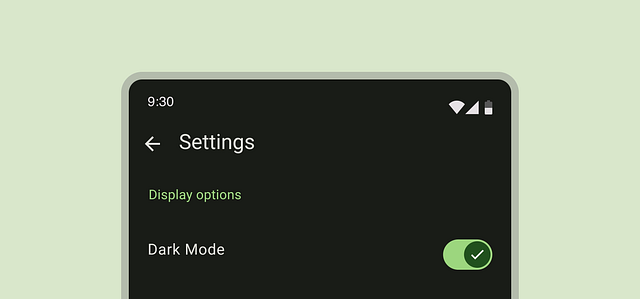
Switches and toggles
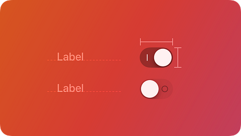
Switches toggle the state of an item on or off. Switches are used in Android while for Apple they are called Toggles
In Android, Switches are the preferred way to adjust settings. They're used to control binary options – think On/Off or True/False.
For Apple, a toggle lets people choose between a pair of opposing states, like on and off, using a different appearance to indicate each state.
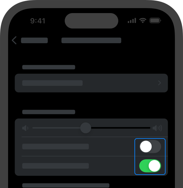
A toggle can have various styles, such as switch and checkbox, and different platforms can use these styles in different ways.
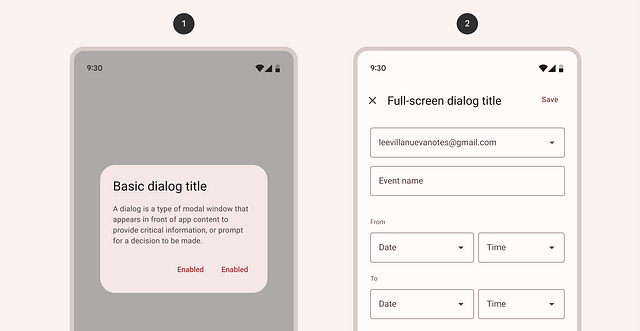
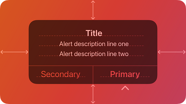
Dialogs and alerts
According to the Material Design website, dialogs are components that inform users about a specific task and may contain critical information, require decisions, or involve multiple tasks. They retain focus until dismissed or a required action has been taken.
Dialogs are purposefully interruptive, so they should be used sparingly. A less disruptive alternative is to use a menu, which provides options without interrupting a user’s experience.
Dialogs are used by Android while Apple uses Alerts
There are two types of dialogs, the basic dialog and the full screen dialog
Anatomy
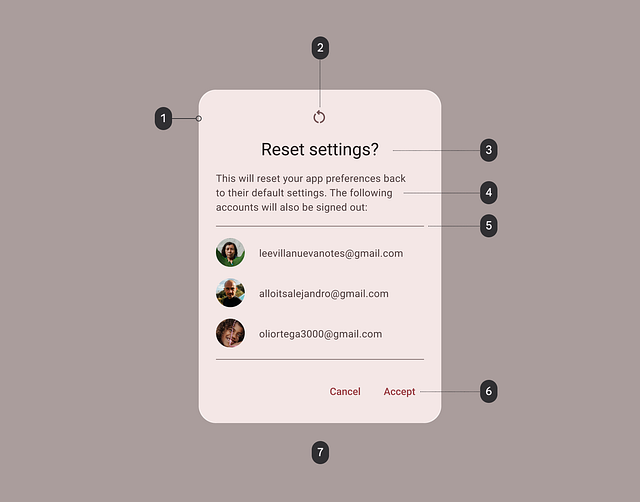
- Container
- Icon (optional)
- Headline (optional)
- Supporting text
- Divider (optional)
- Actions
- Scrim
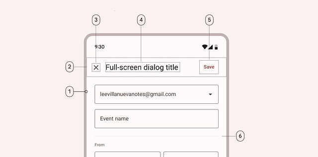
- Container
- Header region
- Close affordance
- Headline (optional)
- Action
- Divider (optional)
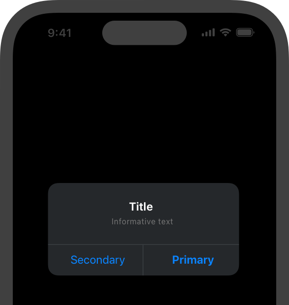
Alerts
These are used by Apple but work in the same context as dialogs.
An alert gives people critical information they need right away.
Alerts should be used sparingly. Alerts give people important information, but they interrupt the current task to do so. Encourage people to pay attention to your alerts by making certain that each one offers only essential information and useful actions.
Thats all i had for this first part of the series, the next will be about tablets. Thank you for reading this far i appreciate it.
Incase of any corrections or additions please comment down below.
See you in the next one shalom