Typography and alphabets stand as fundamental human achievements, serving not merely as tools for recording language but as powerful shapers of culture, thought, and societal structures. Their history is a testament to humanity's quest for effective communication, evolving from rudimentary pictorial representations to complex systems capable of conveying intricate ideas across vast distances and generations. This article embarks on an a journey through this history, examining the "natural history" of typography, the anatomical components that define its visual form, and its often-underestimated role in social activism and nationalistic discourse. Understanding these facets reveals the profound influence of type on human perception and interaction, making it a critical area of study in the broader field of visual communication.
The Evolution of Writing Systems: A Natural History
The journey of typography begins with the invention of writing itself. Two scripts are well-attested from before the end of the 4th millennium BC: Mesopotamian cuneiform and Egyptian hieroglyphs. Egyptian hieroglyphs could function as pictograms, logograms, phonograms, or determinatives. Crucially, the hieroglyphs indicating a single consonant could have been used as a consonantal alphabet, or abjad, an idea that influenced the creation of the first alphabet.
Origins of the Alphabet
The Proto-Sinaitic script, which emerged during the 2nd millennium BC among West Semitic labourers in the Sinai Peninsula, is believed to be the likely single invention of alphabetic writing. This script adapted Egyptian hieroglyphs to write consonantal values based on the first sound of the Semitic name for the object depicted by the hieroglyph, known as the "acrophonic principle". For example, the hieroglyph for 'house' (per) was used to write the sound [b] because [b] was the first sound in the Semitic word bayt 'house'. All later alphabets worldwide either descend directly from Proto-Sinaitic or were inspired by its descendants, with the possible exception of Hangul in Korea and the Meroitic alphabet.
Development of Consonantal and "True" Alphabets
The Proto-Sinaitic script retained its pictographic nature for approximately half a millennium until it was adopted for governmental use in Canaan. The Phoenician city-states, at the center of a vast trade network, made extensive use of this script, leading to later stages being called the "Phoenician alphabet". Like its Egyptian prototype, the Phoenician alphabet represented only consonants, a system now termed an abjad.
The Phoenician alphabet spread throughout the Mediterranean and gave rise to two major variants: the Aramaic alphabet and the Greek alphabet. The Aramaic alphabet, which evolved from Phoenician in the 8th century BC, became the official script of the Assyrian, Babylonian, and Achaemenid Empires, and is the ancestor of nearly all modern alphabets in Asia, including Arabic, Hebrew, Syriac, and the Brahmic scripts. The Arabic alphabet, descended from Aramaic, is the second-most widely used alphabetic script globally and the most used abjad system. By the 8th century BC, the Greeks borrowed the Phoenician alphabet and adapted it, creating the first "true" alphabet by according vowels equal status with consonants. This was crucial for Greek, where vowels played a more significant role than in Semitic languages. The Greeks used Phoenician letters representing consonants not present in Greek speech for their vowels, capitalizing on the acrophonic principle where the initial vowel sound of the letter's name became its representation (e.g., Phoenician ’alepbecame Greek alpha for /a/).
Spread and Diversification
The Greek alphabet, in turn, is the source of all modern scripts of Europe. The alphabet of early Western Greek dialects, where the letter eta remained an /h/, led to the Old Italic alphabet, which then developed into the Old Roman alphabet. The Latins, who became the Romans, adopted writing from the Etruscans and Western Greeks around the 7th century BC, modifying the alphabet to suit their language.
The modern Latin alphabet, the most widely used alphabet today, derives from these Etruscan and Greek antecedents. Modifications over time included the creation of 'G' from 'C', the addition of 'Y' and 'Z' for Greek words, and the development of 'W', 'U', and 'J' from existing forms.While most alphabets trace their lineage back to the Proto-Sinaitic script, some modern national alphabets have evolved graphically independently, such as the Maldivian script (derived from numerals) and the Hangul alphabet used for Korean, created in 1443. The order of letters in the alphabet has shown remarkable stability, attested from the 14th century BC in Ugarit, with orders similar to those used for Hebrew, Greek, and Latin.
Typography's Mechanical and Digital History
The history of typography is a logical evolution toward mechanical and digital efficiency, mirroring a broader shift in human history from manual craft to industrial and computational processes.
From Movable Type to Mass Production
In the mid-fifteenth century, Johannes Gutenberg invented printed letters, marking a revolutionary turning point. His method involved casting individual blocks of type, each bearing a raised letter. Printers arranged these metal characters in gridded wooden cases, inked them, and pressed paper against them. After printing, the metal letters were returned to their cases to be reused. This system remained largely unchanged for four centuries.
In 1884, the Linotype machine integrated the casting process with the composition of lines of text. An operator would strike a keyboard, connecting to a matrix of molds, which then assembled into a sequence. Molten lead was poured into these molds, creating solid lines of type (slugs). After printing, the lead was melted down and recast into new letters. These early technologies dematerialized the making of type, replacing hot metal with photographic negative and then a digital signal.
Typography in the Age of Theory
The mid-nineteenth century saw Charles Darwin's theories on natural history impact how the evolution of organisms was understood, moving away from ordered progress towards random genetic traits. This philosophical shift resonated in typography, which grappled with whether its history was a linear progression towards an ideal form or a series of random responses to technological and aesthetic challenges.
In the early twentieth century, avant-garde designers and theorists began to define a new approach to typography. Figures like Jan Tschichold and Paul Renner were prominent in advocating for structuralist typography, a movement that challenged classical design principles and sought universal models. This period emphasized legibility, logical organization, and geometric forms. The New Typography, defended by Tschichold, sought to mechanize design and move away from traditional decorative forms.
In the mid-nineteenth century, a new "structuralist typography" emerged, replacing ideal forms with a collection of linguistic elements open to manipulation. This perspective views the alphabet as a flexible system, where letterforms are composed of "graphemic mutants"—compressed, expanded, outlined, inlaid, shadowed, and faceted forms that express relationships between letters within a family.Following Gutenberg and Linotype, the philosophy behind printed letters evolved from smaller, more technological and cultural shifts to broader abstract relationships. Modern typography also saw the rise of post-structuralism, particularly influenced by the work of Ferdinand de Saussure and Jacques Derrida. This approach views writing as a not transparent sign system, emphasizing the constructed nature of meaning and the deconstruction of inherent hierarchies. Post-structuralist fonts, like Deck's Template Gothic, intentionally incorporate "mechanical reproduction" errors, reflecting a critique of assumed perfect form.
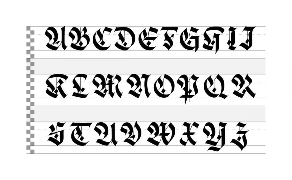
The Anatomy of Type: Building Blocks of Visual Communication
Understanding the anatomy of type is crucial for effective visual communication, as it describes the visual elements that constitute letterforms within a typeface. These individual components contribute significantly to a typeface's overall appearance and legibility.
Key Typographic Terms
Type has its own specialized language, encompassing numerous terms that describe its basic anatomy. These include:
Aperture:
The partially enclosed space of a letterform.
Ascender
An upward vertical stroke extending beyond the x-height.
Baseline
The invisible line on which all letters rest, serving as a reference point for visual consistency.
Bowl
The generally round or elliptical forms that make up the basic body shape of letters.
Cap height
The distance from the baseline to the top of a capital letter.
Counter
The white space enclosed by a letterform, which can be fully enclosed (like in 'o' or 'b') or partially open (like in 'c' or 'e').
Crossbar
The horizontal stroke connecting two sides of a letter (e.g., in 'E', 'F', 't').
Descender
A downward vertical stroke extending below the baseline (e.g., in 'g', 'j', 'p', 'q', 'y').
Dot/Tittle
A small diacritic on a lowercase 'i' or 'j'.
Eye
The closed counter of a lowercase 'e'.
Finial
A tapered or curved end on a letterform.
Ligature
Two or more letters tied into a single character (e.g., 'fi', 'fl').
Lowercase
The smaller forms of letters in a typeface.
Shoulder
A curved stroke originating from a stem (e.g., in 'h', 'n', 'm').
Spine
The main curved stroke of a lowercase or capital letter, particularly distinct in 'S'.
Stem
A main stroke that is more or less straight, not part of a bowl.
Serif
A small stroke added to the beginning or end of one of the main strokes of a letter.
Small Capital
Short capital letters designed to blend with lowercase text.
Stroke
A straight or curved line that creates the principal part of a letter.
Terminal
A circular form at the end of an arm, leg, or brow in letters that does not include a serif.
Uppercase
Capital letters.
x-height
The distance between the baseline and the height of the lowercase letter ‘x’.
Weight
The thickness of a font’s stroke.
Design Considerations and Font Types
Effective typography also involves practical design considerations.
- Kerning refers to adjusting the space between two individual letters
- Tracking adjusts the space between a whole group of letters.
- Leading is the adjustment of vertical space between lines of text. These adjustments are crucial for legibility(how easy it is to distinguish individual letters) and readability (how comfortably users can read the text).
Fonts are broadly categorized into four major types:
- Serif Fonts: Traditional and highly legible, characterized by small lines at the ends of strokes (e.g., Times New Roman).
- Sans-serif Fonts: Modern and clean, lacking serifs (e.g., Arial).
- Script Fonts: Mimic handwriting, often fluid and cursive (e.g., Brush Script).
- Display Fonts: Highly stylized for headings and decorative purposes, not typically suitable for body text due to reduced readability.
Typography as a Tool for Sociopolitical Influence: Activism and Nationalism
Typography is far from a neutral tool; it is a powerful vehicle for ideas, deeply intertwined with social and political movements. Its visual forms and applications carry significant moral weight and can be instrumental in both fostering coexistence and propagating division.
Typography and Activism
For centuries, typography has played a central, though often silent, role in expressing societal concerns and demands. Social activism harnesses typography's communicative power to spread its message, evident in banners, posters, and flyers. In urgent contexts of protest, the full visual force of writing is perceived, where the tension between a letter as a communication vehicle and a visual object bursts forth. Makeshift execution, such as stenciled sans-serif fonts, collaged cut-out letters, or irregular hand-traced capitals, can create remarkably inspiring works while retaining their activist message.
Historically, pamphlets and broadsheets in 18th-century Western Europe denounced abuses, and 19th-century suffragist movements used slogans as powerful communication tools, condensing complex ideas into concise visual symbols.In the modern digital paradigm, social networks have opened new spaces for civic movements, with typography reinforcing its role through new technical possibilities. Letters are no longer static but can move, transform, and change color dynamically.
The shift is also conceptual, connecting type design to contemporary society's diversity and dynamism. Typographic commitment manifests in various ways:
- Fundraising and Social Impact: Projects like "Buy Fonts Save Lives" donate proceeds from font sales to charities.
- Protest and Advocacy: "Public Protest Poster" combined digital and physical platforms for isolated individuals to voice demands during lockdowns.
- Countering Discriminatory Rhetoric: "#notwithmytype" uses font code tweaks to replace offensive words with asterisks, demonstrating typography's role in combating hatred, racism, and xenophobia.
- Inclusive Language: The Franco-Belgian collective "Bye Bye Binary" challenges binarism through type design, seeking to reflect human nature's richness and complexity.
Typography and Nationalism under Nazi Rule
The Nazi regime offers an example of typography's instrumentalization for nationalism, exclusion, racial discrimination, and gender stereotyping. This contradicts Benedict Anderson's theory in "Imagined Communities," which posits that the nation is conceived in language and print-languages are intrinsically inclusive, inviting individuals into the imagined community. Nazism, however, manipulated language and typography to define and enforce strict boundaries for its "Aryan" community.
Fraktur
For almost 500 years, Fraktur typefaces were a visual signature for German texts, differentiating them from languages printed in Roman letters. Nationalist associations promoted Fraktur as the "authentically German letterform". Despite this, in January 1941, a circular "on behalf of the Führer" declared Fraktur to be "Jewish letters" and mandated their replacement with "normal" (Roman) ones, prohibiting their production. This seemingly contradictory move, synchronized with Hitler's invasion of Soviet Russia, aimed to facilitate the spread of Nazi news narratives in internationally circulated publications. The ban also implicitly defined non-Roman scripts as "abnormal".
Nazi propaganda employed various typographic styles, adapting them to specific audiences and messages.
Ahnenerbe Institute
This SS-controlled organization, tasked with researching and promoting "northern racial Indogermanism," used typography to fabricate an "Aryan" past. Herman Wirth, an early president, claimed "Nordic-Aryans" invented a well-developed writing system resembling pseudo-runes, which he scattered throughout his books like Der Aufgang der Menschheit. The Ahnenerbe imprint and SS insignia themselves mimicked runic forms. While Ahnenerbe editions switched to Roman type in 1941, earlier books, such as Axt und Kreuz bei den Nordgermanen (1939), used Didone styles. Luxurious book designs, including heavy paper, ample ink, and well-reproduced photographs, portrayed violence as neutrality, despite their content serving Himmler's genocidal aims. Significantly, the 1943 Ahnenerbe edition of Handschriftliche Untersuchungen zu Tacitus Agricola und Germania, which included a facsimile of the Codex Aesinas(believed to confirm German racial purity), was handwritten in Roman style, not Fraktur, bestowing an aura of legitimacy on Nazism.
NS-Frauen-Warte
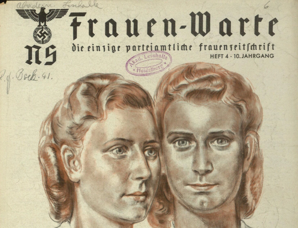
This biweekly women's magazine, the "only party-authorized women's magazine," aimed to indoctrinate women into specific "Aryan" gender roles (housewives, mothers). Unlike other publications, its body text remained in Fraktur until its last issue (1944–45), and titles in cursive or Sütterlin handwriting were introduced. This deliberate choice, alongside idyllic countryside images, fabricated a world of hills, trees, and flowers, diverting from the brutal reality of the Nazi regime and the systematic euthanasia program it promoted, where human-evoking handletters and italics were used to "paint horror with pastel colours". Fraktur in this context embodied the "pure 'Aryan' genes" and marked belonging to the national racial community.
Völkischer Beobachter
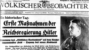
The Nazi party's newspaper showcased a mix of lettering but incorporated modernist design elements. Its logo changed to Roman letters in August 1923, and a 1930 redesign introduced thick, red-underlined headlines (often in slab serif), photographs, and typographic details reminiscent of Paul Renner's Futura bold and Jan Tschichold's designs. This appropriation of modernist aesthetics, despite the Nazi regime's aggressive stance against modernism (e.g., sealing off the Bauhaus), highlights a complex relationship. The newspaper swiftly adopted Roman headlines by March 1941 following the anti-Fraktur directive, often using Grotesks and slab serifs that further borrowed from modernist guidelines.
Racialization and Exclusion
The Nazi regime racialized letterforms by building on the pre-existing notion that language was a racial attribute. Fraktur and Sütterlin scripts became genderized, associated with women and children as the propagators of the "Aryan race," while Grotesk typefaces were used for SS men and for Hitler's own letterhead. A poster explaining the Nuremberg Laws clearly illustrated this: texts in Fraktur were used within national borders for "Aryans," while signs in Grotesk addressed bordering countries and marked exclusion. This demonstrated how a typographic style once common for German language was re-appropriated to mark race and national frontiers.
Modernism's Contradictory Role
The dispute between Jan Tschichold and Max Bill in 1946 exposed the disturbing intersection of modernist typography with Nazi design. Bill attacked Tschichold for abandoning modernism for "Heimatstil," a term stained with Nazi "blood and soil" connotations. Tschichold argued that Nazism and modernism shared an "unrestrained exaltation of progress and quest for absolute models". Indeed, an official guide to a 1936 Berlin exhibition, designed with modernist signatures like square format, geometric photographs, and Didone typefaces, promoted corporations known for exploiting slave labor, showcasing how modern aesthetics could serve the regime's image of progress and worldwide empire.In the end, while Fraktur served to address and portray the "Aryan" national community, Grotesks, borrowed from modernism, helped shape the image of a new mechanical order and a supreme group of male leaders planning mass murder. This demonstrates that the regime authorized and even privileged typefaces that now symbolize neutrality, order, and progress, camouflaging Nazism in forms of normality.
Detailed Timeline of Typography and Alphabets
2nd Millennium BCE (c. 1850 BCE)
- Proto-Sinaitic Script Emerges: A community of West Semitic laborers in the Sinai Peninsula invents the Proto-Sinaitic script, influenced by Egyptian hieroglyphs, to write their native West Semitic languages. This script uses the "acrophonic principle," where a hieroglyph depicting an object is used to represent the first sound of the Semitic name for that object. This is considered the first Semitic alphabet, and the ancestor of nearly all later alphabets.
12th Century BCE
- Phoenician Alphabet Develops: The Proto-Canaanite script, a descendant of Proto-Sinaitic, is extensively adopted by Phoenician city-states, leading to its evolution into the Phoenician alphabet. This alphabet, like its prototype, represents only consonants (an abjad).
8th Century BCE
- Aramaic Alphabet Evolves: The Aramaic alphabet evolves from the Phoenician alphabet. It later becomes the official script of the Assyrian, Babylonian, and Achaemenid Empires, and is the ancestor of most modern alphabets in Asia.
- Greek Alphabet Adapts Phoenician: The Greeks borrow and adapt the Phoenician alphabet to their language, creating the first "true" alphabet that includes separate letters for vowels, a crucial innovation for their language. Cadmus is credited in Greek legends with bringing the alphabet from Phoenicia to Greece.
- Latin Alphabet Borrowing Begins: The Latins (Romans) begin to adopt writing from the Etruscans and Western Greeks in central Italy.
7th Century BCE
- Latin Alphabet Development: The Latins adapt the Etruscan and Western Greek alphabets, dropping four characters, modifying others (e.g., Etruscan F to /f/ sound, Etruscan S to modern S, Gamma for G sound), forming an early version of the Latin alphabet without G, J, U, W, Y, and Z.
3rd Century BCE
- Meroitic Alphabet Adaptation: The Meroitic alphabet, a possible independent adaptation of hieroglyphs, emerges in Nubia.
- Latin Alphabet Incorporates Greek Letters: After Alexander the Great's conquests, Romans begin borrowing Greek words and adapt their alphabet by adding Y and Z (from the Eastern Greek alphabet) to the end, specifically for Greek words.
4th Century CE
- Armenian Alphabet Creation: Mesrop Mashtots is credited with creating the Armenian alphabet.
6th Century CE
- Latin Alphabet Adopted by Anglo-Saxons: Following Augustine of Canterbury's mission to Christianize Britain, the Anglo-Saxons begin writing Old English using the Latin alphabet. The rune wen for the /w/ sound is replaced by a double U (which looked like two Vs).
9th Century CE (c. 862 CE)
- Glagolitic Alphabet Creation: The Glagolitic alphabet is created, an ancestor of Cyrillic and derived from Eastern Greek variants.
10th Century CE (c. 940 CE)
- Cyrillic Alphabet Emerges: The Cyrillic alphabet develops, also derived from Eastern Greek variants.
13th Century
- Oera Linda Book Allegedly Written: The fake "Oera Linda Book From a Manuscript of the Thirteenth Century" is claimed to have been written, later used by Herman Wirth to promote his "Nordic-Aryan race" theories.
15th Century
- Latin Alphabet Develops 'J': The letter J begins as a variation of I, with a long tail on the final I in a series. It becomes used for consonants, while I is used for vowels.
- Codex Aesinas Created: The Codex Aesinas, a handwritten Roman-style manuscript believed to be the oldest extant copy of Tacitus' Germania, is produced.
1443
- Hangul Alphabet Invented: The Hangul alphabet, used to write Korean, is created. It is one of the few national alphabets not graphically traced back to the Canaanite alphabet.
Mid-15th Century
- Gutenberg's Printing Press: Johannes Gutenberg invents printed letters, individual metal blocks cast for each character, which are arranged to form lines, inked, and pressed onto paper. This revolutionizes typography.
1501
- Latin-German Dictionary in Fraktur: Melchior Lotter prints Vocabularius optimus, a Latin-German dictionary in Leipzig, with both languages flowing undifferentiated in Fraktur typeface.
16th Century Onward
- Fraktur Becomes German-Specific: Dictionaries show Roman typefaces spreading across other languages while German consistently uses Fraktur, making it a visual signature for the German language.
Mid-17th Century
- 'J' Fully Accepted: The letter J is fully accepted in the Latin alphabet as a distinct character for consonants.
18th Century
- Rise of Pamphlets and Broadsheets: In Western Europe, anonymous pamphlets and broadsheets denouncing abuses of power begin circulating, using early forms of typographic communication for activism.
1794
- German Romanized in Dictionaries: The Soldier's Pocket-dictionary, or Friend in Need in London romanizes German text, indicating Fraktur's increasing unfamiliarity to international readers.
1799
- Universal European Dictionary of Merchandise Romanizes German: This multilingual dictionary published in London romanizes German and Russian, further suggesting Fraktur's diminishing international use for continuous reading.
1844
- Danish Shifts to Roman for Continuous Reading: Søren Kierkegaard's Forord. Morskabslæsning for enkelte Stænder efter Tid og Lejlighed is published in Copenhagen in Roman typeface, indicating a shift away from Fraktur for continuous Danish text.
1872
- Thet Oera Linda Bok Published: The original edition of Thet Oera Linda Bok, naar een handschrift uit de dertiende eeuw is published in Leeuwarden, Netherlands, with "facsimile" pages in rune-styled letters.
1884
- Linotype Machine Invented: Ottmar Mergenthaler invents the Linotype machine, which casts whole lines of text from molten lead, significantly accelerating typesetting.
1887
- Münchener Beobachter Founded: The newspaper later known as Völkischer Beobachter is founded as Münchener Beobachter.
1899
- Die Grundlagen des neunzehnten Jahrhunderts Published: Houston Stewart Chamberlain's anti-Semitic bestseller is first issued, influencing leading Nazis like Hitler, Goebbels, and Himmler.
Around 1918-1919
- Völkischer Beobachter Renamed: Münchener Beobachter is renamed Völkischer Beobachter.
1911
- Reichstag Votes to Maintain Fraktur: The Reichstag votes by 75% to maintain Fraktur as the official German script, despite a petition for Roman letters in literacy classes.
- Dictionnaire universel pour la traduction des menus (French, German, English) published in Zurich also romanized German.
1918
- German Women Gain Suffrage: All German women over 20 are granted the right to vote.
1919
- Völkischer Beobachter Sold to Thule Society: The newspaper is sold to the Thule Society.
- Women in National Assembly: Women occupy 9.6% of the National Assembly in Germany, a high rate for the time.
1920
- Völkischer Beobachter Sold to Nazi Party: The newspaper is re-sold to the Nazi party.
1923
- Völkischer Beobachter Logo Changes to Roman: In August, the Völkischer Beobachter logo changes to Roman letters.
- Hitler's Failed Coup; Newspaper Banned: The Völkischer Beobachter is banned after Hitler's failed coup.
- Herman Wirth Translates Oera Linda Chronik: Wirth translates the Oera Linda Chronik to German, presenting the hoax as trustworthy.
1925
- Völkischer Beobachter Resumes Publication: The newspaper resumes publication after its ban.
- Tschichold Publishes Typographische Mitteilungen: Jan Tschichold publishes Typographische Mitteilungen, featuring design elements later plagiarized by the Völkischer Beobachter.
1928
- Der Aufgang der Menschheit Published: Herman Wirth publishes Der Aufgang der Menschheit, scattering pseudo-runes throughout the text to support his theories.
1930
- Völkischer Beobachter Redesign: A redesign in January-March adds thick strokes (often slab serif) to headlines and introduces photographs.
- Libel Against Tschichold: The Völkischer Beobachter publishes a libel against Jan Tschichold, accusing him of being a "Bolshevist."
1931-1933
- NS-Frauenschaft Oversees NS-Frauen-Warte: Elsbeth Zander oversees the women's magazine NS-Frauen-Warte.
1932
- NS-Frauen-Warte Launched: The Nazi party launches the biweekly women's magazine NS-Frauen-Warte.
- Bauhaus Sealed Off: The Nazi regime seals off the Bauhaus.
Early 1933
- Tschichold and Renner Arrested: Modernist typographers Jan Tschichold and Paul Renner are arrested.
March 1933
- Joseph Goebbels' Speech on Women: Goebbels declares the significance of women for the nation in an exhibition opening speech, promoting traditional roles while addressing modern concerns.
1933-1934
- Lydia Gottschewski Oversees NS-Frauen-Warte: Lydia Gottschewski takes over leadership of NS-Frauen-Warte.
January 1934
- NS-Frauen-Warte Slogan Change: The magazine's slogan changes to "the only party-authorized women's magazine," reflecting women's disenfranchisement.
1934
- Gertrud Scholtz-Klink Appointed Head of Nazi Women's Bureau: Hitler appoints Gertrud Scholtz-Klink, who also leads NS-Frauenschaft and NS-Frauen-Warte for eleven years.
July 1, 1935
- Ahnenerbe Founded: The "Ancestral Heritage Society" (Ahnenerbe) is founded under Heinrich Himmler's command.
1935-1936
- NS-Frauen-Warte Portrait of Scholtz-Klink: A portrait of Gertrud Scholtz-Klink and her children, embodying the "blood and soil" style, is published in NS-Frauen-Warte.
1936
- Germanien Published: The Ahnenerbe magazine Germanien is published.
- Amtlicher Führer durch die Ausstellung Deutschland Catalogue: The official guide for the Germany exhibition during the Olympic Games is designed with modernist signatures and Roman typefaces for an international audience.
- Trau keinem Fuchs auf grüner Heid... (Children's Book): An antisemitic children's book is published in Sütterlin script.
- Urväter-Erbe in deutscher Volkskunst: Oskar von Zaborsky-Wahlstätten's book with inserted symbols is published by Ahnenerbe.
January 1938
- Cursive Styles in NS-Frauen-Warte: Cursive styles are introduced in NS-Frauen-Warte, initially in the fashion section.
February 1938
- NS-Frauen-Warte Redesign: The magazine undergoes a major redesign, likely timed with the annexation of Austria, featuring full-color, full-page covers.
March-April 1938
- Annexation of Austria: Austria is annexed by Germany, legitimized during this period.
- NS-Frauen-Warte Features Map of German Empire: In April, a map of the new German empire on a red background fills the cover.
May 1938
- NS-Frauen-Warte Features "Blood and Soil" Landscape: A cover depicting a landscape typical of the "blood and soil" genre is published.
September 1939
- WWII Begins; NS-Frauen-Warte Cover: The beginning of World War II is announced in NS-Frauen-Warte with a sunflower on the cover and an article portraying singing soldiers.
- Hitler's Euthanasia Order: Hitler signs an order in uppercase Grotesk to increase physicians' authority to perform euthanasia.
October 1940
- NS-Frauen-Warte Article on Polish "Home": An article describes a new home for German elderly in Poland, fabricating an idyllic scene over a former psychiatric hospital whose patients were likely killed.
Early January 1941
- Fraktur Declared "Jewish Letters": A circular "on behalf of the Führer" declares Fraktur to be "Jewish letters" and orders their replacement with "normal" (Roman) ones. This order is synchronized with Hitler's invasion of Soviet Russia.
1941
- Ahnenerbe Editions Switch to Roman: Ahnenerbe editions switch to Roman typeface.
- Franco's Regime Subsidizes Excavations: Franco's regime in Spain subsidizes excavations in Segovia, pre-coordinated with the Ahnenerbe.
- Waffen SS Recruitment Poster: A recruitment poster in sans-serif for the Waffen SS is issued.
- Völkischer Beobachter Headlines Change to Roman: On March 18, Völkischer Beobachter headlines change to Roman.
- Einsatzgruppen Mass Murder: SS and police units begin mass murdering Jews, Roma, and political opponents following the invasion of the Soviet Union.
June 1941
- Völkischer Beobachter Front Cover Body Text Changes: The front cover body text of Völkischer Beobachter changes to Roman.
August 1941
- Völkischer Beobachter Almost Entirely Roman: Almost no Fraktur remains in the Völkischer Beobachter.
c. October 1941
- Stahlecker Report Map: A map showing the number of Jews killed by Einsatzgruppen A is part of a report compiled by SS Brigadier General Franz Stahlecker.
1942
- NS-Frauen-Warte Frequency Decreases: The magazine's frequency decreases.
- NS-Frauen-Warte Article on Foreign Workers: An eroticized photograph of a "German worker" is published in NS-Frauen-Warte, accompanied by text campaigning against racial contamination with un-German blood, especially Polish.
- Ahnenerbe Pressured for Military Research: An order in July presses the Ahnenerbe to conduct military research.
February 1942
- Sievers' Report to Himmler: Wolfram Sievers submits a horrifying report to Heinrich Himmler about procuring skulls of "Jewish-Bolshevik Commissars" for "scientific documentation."
1943
- Handschriftliche Untersuchungen zu Tacitus Agricola und Germania Published: The Ahnenerbe publishes a study about Tacitus' Agricola and Germania, including a facsimile of the Codex Aesinas, emphasizing an "Aryan" past despite ongoing German defeats.
- Cheaper Paper for Ahnenerbe Editions: Some Ahnenerbe editions use cheaper paper stock due to wartime conditions.
1944
- NS-Frauen-Warte Article on Outdoor Fireplace: An article teaching how to build an outdoor fireplace is published in NS-Frauen-Warte, with a flourished script resembling wedding invitations.
1944-1945 (probably early 1945)
- Last Issue of NS-Frauen-Warte: The last issue of NS-Frauen-Warte is published, with the body text remaining in Fraktur.
March 23, 1945
- Hitler's Orders on Reich Letterhead: Hitler's orders, signed by Albert Speer, are recorded on the Reich's official letterhead and stamps in Grotesk typefaces, just weeks before his suicide.
1946
- Tschichold-Bill Dispute: A public dispute erupts between Jan Tschichold and Max Bill in the magazine Schweizer Graphische Mitteilungen regarding modernism and its relation to Nazi ideology.
1949
- Medical Science under Dictatorship: Leo Alexander publishes "Medical science under dictatorship," discussing the euthanasia program.
2002
- Interaction Design Foundation Founded: The Interaction Design Foundation is founded.
2018
- Bye Bye Binary Collective Founded: The Franco-Belgian collective Bye Bye Binary begins working on post-binary inclusive language and type design.
2020
- Typography and nationalism: the past and modernism under Nazi rule Published: Mila Waldeck's article is published in the Journal of Visual Political Communication.
2021
- What is Anatomy of Type? Published: The Interaction Design Foundation publishes "What is Anatomy of Type?"
September 2, 2025
- Typography and Activism Published: Buenaventura Studio publishes "Typography and Activism. The Power of Visual Communication."
Cast of Characters
J. Abbott Miller & Ellen Lupton
Authors of "A Natural History of Typography," providing insights into the historical development of typography, including the mechanical advancements and theoretical shifts.
Charles Darwin
(Mentioned) Naturalist who broke from earlier approaches to natural history with his theory of evolution, which influenced discussions on "natural selection" and "survival of the fittest" in a broader cultural context, though not directly related to typography in his original work.
Ferdinand de Saussure (1857-1913):
(Mentioned) Linguist whose work on language as a system of arbitrary, conventional, and inter-changeable relationships influenced "structuralist typography" and "post-structuralism," which challenged the idea of language as a transparent sign system.
Johannes Gutenberg
Inventor of the printing press in the mid-15th century, revolutionizing typography with movable metal type and making mass production of texts possible.
Ottmar Mergenthaler
Inventor of the Linotype machine in 1884, which mechanized typesetting by casting whole lines of text.
The Bodoni and Didot Families
(Mentioned) Influential typographers who initiated a "break" in nineteenth-century commercial typography, leading to new typefaces and the modernization of type manufacture.
Daniel Berkeley Updike
(Mentioned) Historian and master printer who later denounced the pantograph's tendency to "mechanize the design of types."
Josef Albers (1888-1976)
(Mentioned) A proponent of De Stijl artistic movement, whose 1941 design for Die Vet exemplifies typefaces built out of geometric shapes.
Herbert Bayer (1900-1985)
(Mentioned) A former Bauhaus alumni and teacher, known for his modernist designs, including a brochure for the 1936 Berlin exhibition, featuring photomontages and propagandizing industrial power.
Laszlo Moholy-Nagy (1895-1946)
(Mentioned) Another Bauhaus figure whose 1919 design for Vom Stijl is cited as an example of typefaces built out of geometric shapes.
Bart van der Leck (1876-1958)
(Mentioned) A key figure in the De Stijl movement, whose 1941 design for Die Vet is mentioned.
Herbert Spencer
(Mentioned) English philosopher known for his concept of "survival of the fittest," applied to various fields, including linguistic theory, which the Nazis would distort.
J. Christopher Herritage
(Mentioned) A scholar whose work is cited in connection with the American Type Founders Company's proliferation of typefaces.
Max Bill
(Mentioned) A designer and proponent of functional typography. He was involved in a dispute with Jan Tschichold in 1946, attacking Tschichold for abandoning modernism and embracing "Heimatstil," implicitly linking it to Nazi ideology.
Jan Tschichold (1902-1974)
Modernist typographer who was arrested by the Nazi regime in 1933. He later became a critic of modernism, arguing that its unrestrained exaltation of progress and quest for absolute models resembled aspects of Nazism. His Typographische Mitteilungen (1925) influenced later Nazi newspaper design.
Paul Renner (1878-1956)
(Mentioned) Typographer known for the Futura typeface, also arrested by the Nazis in 1933. His work, like Tschichold's, was paradoxically appropriated by Nazi propaganda.
Zuzana Licko (b. 1961)
(Mentioned) Designer whose work in early twentieth-century avant-garde typography is cited.
Jeffery Keedy
(Mentioned) Designer whose work in early twentieth-century avant-garde typography is cited.
Max Kissman (1988)
(Mentioned) Designer of the 1988 Zuzana typeface, reflecting minimalist aesthetics.
Gottfried Semper (1803-1879)
(Mentioned) Architectural theorist whose "four basic elements" are referenced in the context of early 20th-century type design.
Louis-Jean-François Lagrenée (1725-1805)
(Mentioned) An artist whose work "Diana and Endymion" is referenced in discussion of 20th-century typography.
Johannes Itten (1888-1967)
(Mentioned) Bauhaus master, whose concepts are discussed in the context of 20th-century typography.
Adrian Frutiger (1928-2015)
(Mentioned) Swiss typeface designer, whose Univers typeface (1954) is referenced as a classic example of modern sans-serif.
Gilles Deleuze (1925-1995) & Félix Guattari (1930-1992)
(Mentioned) Philosophers whose work "A Thousand Plateaus" is cited in the context of 20th-century typography.
Claude Levi-Strauss (1908-2009)
(Mentioned) Anthropologist whose work influenced Saussurean linguistics and structuralism in the context of 20th-century typography.
Roland Barthes (1915-1980)
(Mentioned) Literary theorist whose "philosophy of writing" is mentioned in the context of 20th-century typography.
Jacques Derrida (1930-2004)
Philosopher who challenged Saussure's approach, arguing that language does not have a "transcendent signified" and that meaning is always deferred, contributing to "post-structuralist theory." He is also credited with coining the term "abjad" for consonantal alphabets in 1996.
Victor Shklovsky (1893-1984)
(Mentioned) Russian Formalist critic whose work on "defamiliarization" influenced the Bauhaus and Russian Constructivism.
Maxim Gorky (1868-1936)
(Mentioned) Russian writer whose work is mentioned in the context of the Bauhaus and Russian Constructivism.
Richard Wagner (1813-1883)
(Mentioned) German composer whose work is referenced in the context of early 20th-century typography.
Barry Deck
(Mentioned) Designer of the 1990 Canicula Script and Template Gothic typefaces, exemplifying "post-structuralist" design.
Jeffery Keedy
(Mentioned) Designer of the 1990 Manuscript typeface, exemplifying "post-structuralist" design.
Zuzana Licko
(Mentioned) Designer of the 1989 Lunatiks typeface, exemplifying "post-structuralist" design.
Tibor Kalman: (Mentioned) Author of "Good History/Bad History."
J. Abbott Miller: Co-author of "Good History/Bad History."
Karrie Jacobs: Co-author of "Good History/Bad History."
Roy Orbison, Sugar Ray Leonard: (Mentioned) Figures from the 1970s and 1980s, used as cultural references in the context of "Good History/Bad History."
Melchior Lotter: Printer of Vocabularius optimus in 1501, a Latin-German dictionary printed in Fraktur.
Nicolao Volkmaro: Author of a Latin-German-Polish dictionary printed by Iaccobi Rhodi in 1596, where German and Polish were in Fraktur, and Latin in italic.
Hieronymus Megiser: Author of the multilingual Thesaurus Polyglottus printed in 1603, showing Polish in italic and German in Fraktur.
Søren Kierkegaard: Danish philosopher whose Forord. Morskabslæsning for enkelte Stænder efter Tid og Lejlighed (1844) was published in Roman type, indicating a shift away from Fraktur for continuous Danish text.
Heinrich Himmler: Leader of the SS and head of the Ahnenerbe institute, a key figure in implementing the Holocaust. He actively used typography as a tool for Nazi propaganda and racial discrimination.
Herman Wirth: Dutch author and initial president of the Ahnenerbe. He promoted theories of a "Nordic-Aryan race" and used pseudo-runes in his publications, such as Der Aufgang der Menschheit (1928) and his 1933 translation of the Oera Linda Chronik.
Wilhelm Ziegler: Author of Was Wird Mit Frankreich?, a paperback edition published by Ahnenerbe.
Rudolf Till: Author of the 108-page text in Handschriftliche Untersuchungen zu Tacitus Agricola und Germania, published by Ahnenerbe in 1943.
Wolfram Sievers: Ahnenerbe manager and minister of culture in Himmler's SS empire. He worked with Wirth and later for Bruckmann, rising to be second only to Himmler in the Ahnenerbe hierarchy. He submitted a chilling report to Himmler in 1942 about collecting skulls for "scientific documentation."
Walther Wüst: Professor in the "Department of Aryan Culture and Linguistics" at the University of Munich and Rector (1941-1945). He was second to Himmler in the Ahnenerbe official hierarchy.
Houston Stewart Chamberlain: English Germanophile and author of the anti-Semitic bestseller Die Grundlagen des neunzehnten Jahrhunderts (1899), which influenced Hitler, Goebbels, and Himmler.
Joseph Goebbels: Nazi propaganda minister. He made speeches defining women's roles in Nazi society and was influenced by Chamberlain's ideas. His novel Michael echoed Chamberlain's claims about Jesus.
Francisco Gracia Alonso: Scholar who documented Franco's regime's collaboration with the Ahnenerbe in archaeological excavations in Spain.
Julio Martínez Santa Olalla: Spanish archaeologist who led excavations in Segovia in 1941, pre-coordinated with the Ahnenerbe.
Joachim Werner: Professor from Tübingen University and Inspector General of the Belgian Museums, who initiated a publication about the Segovia expedition at Himmler's request.
Franz Winter: Scholar who highlighted the religious significance of the Oera Linda book for Himmler.
Telford Taylor: Chief prosecutor in the Nuremberg Military Tribunals who presented Sievers' horrifying report.
August Hirt: Director of the anatomical institute at the Reich University in Strasbourg, who conceived the "scientific document" of collecting skulls of "Jewish-Bolshevik Commissars."
Elsbeth Zander: Head of the women's league of the Nazi party (NS-Frauenschaft), who oversaw NS-Frauen-Warte from 1931-1933.
Lydia Gottschewski: Oversaw NS-Frauen-Warte from 1933-1934.
Gertrud Scholtz-Klink: Appointed by Hitler as head of the Nazi Women's Bureau in 1934. She led NS-Frauenschaft and NS-Frauen-Warte for eleven years and visited concentration camps. She was prominently featured in NS-Frauen-Warte as an embodiment of "blood and soil" ideology.
Leo Alexander: Author of "Medical science under dictatorship" (1949), who argued that institutions involved in the euthanasia program used innocent-sounding names to mask their atrocities.
Richard Walther Darré: (Mentioned) Promoted and implemented the "blood and soil" ideology, which Fraktur became the typographic voice for.
Max Amann: Publisher of the Völkischer Beobachter.
Dietrich Eckart: Editor of the Völkischer Beobachter until 1923.
Alfred Rosenberg: Succeeded Eckart as editor of the Völkischer Beobachter (1923-1938).
Wilhelm Weiss: Editor of the Völkischer Beobachter (1938-1945).
Theodor Adorno & Max Horkheimer: Authors of Dialectic of Enlightenment, who argued that Nazism was not antithetical to modernity but part of it, viewing individuals as replaceable processes in industrial society.
Benedict Anderson: Author of Imagined Communities: Reflections on the Origin and Spread of Nationalism, who argued that nations are imagined communities conceived in language, not blood, and that print-languages were crucial for national consciousness.
M. A. K. Halliday: (Mentioned) Linguist who made the point that language shapes perception of reality and is shaped by its historical uses, relevant to how Nazis manipulated existing linguistic and typographic conventions.
Eric Hobsbawm: (Mentioned) Historian who claimed that national symbols do not need fact-checked historical origins, but function to construct a vivid image of the nation, even if invented.
George Salter: (Mentioned) Book cover designer for S. Fischer Verlag before 1934, whose work represents a design style that largely disappeared under Nazi rule.
Ana Moliz: Art Director at Buenaventura Studio and author of "Typography and Activism. The Power of Visual Communication."
Mia Cinelli: Associate Professor of Art Studio and Digital Design at the University of Kentucky, and an expert on type anatomy for the Interaction Design Foundation.
Joann Eckstut: Color Consultant and co-founder of The Roomworks, an expert for the Interaction Design Foundation.
Arielle Eckstut: Author and literary agent, co-founder of The Book Doctors, and an expert for the Interaction Design Foundation.